Intro
Mehaffey Consulting is a firm specializing in First Nations treaty negotiations. Rooted in respect, collaboration, and a profound understanding of Indigenous governmental landscapes, they're dedicated to bridging gaps for underserved communities.
Services
Brand Identity (rebrand)
Website Design
Problem
Matthew Mehaffey lacked a defined brand personality, consistent brand identity overall and online presence. Operating within a complex landscape and prioritizing cultural sensitivity, the exclusion of indigenous art was a conscious decision.
Collaborations
Website Development: Wizardry Labs
Solution
Guided by the Advocate, Translator, and Explorer personas, Matt sought a nuanced understanding derived from extensive real-life experiences and perspectives of indigenous communities across Canada.
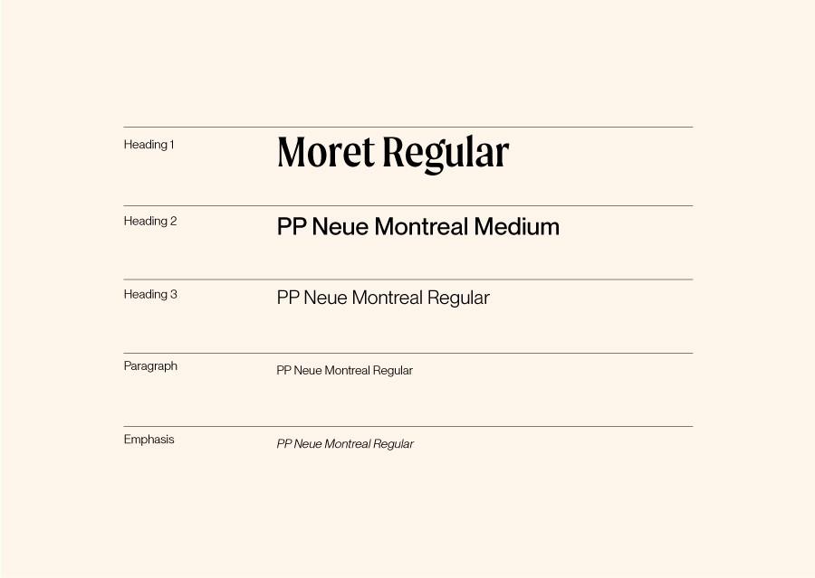
The logo draws inspiration from blackletter typography, historically prominent in Western Europe from approximately 1150 to the 17th century, notably used in traditional newspaper headlines. This choice conveys a sense of profound expertise and professionalism within the field. The monogram, presenting an intertwined 'M' and 'C' in a three-dimensional form, signifies unity. While uppercase lettering often evokes dominance, in this display font, it exudes personality, creating a harmonious balance when paired with a friendly, neutral grotesque typeface in title case.


